Making the Case for User-Centred Design

In 2008, CanWest’s digital news network needed a fresh start. Audience growth was waning, and senior managment was ready to consider something new. Many strategies were considered, most of which proposed adding features to attract new readers.

Knowing that the news network had serious UX issues, the answer seemed obvious to me: the best way to grow readership would be to stop driving people away. Proving it would be another matter.

Identifying UX Issues With a Heuristic Analysis

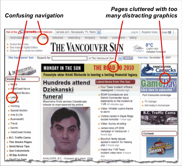
I started with a type of usability audit called a Heuristic Analysis, where the digital product is evaluated against a set of predefined design principles. Using Jakob Neilen’s 10 Heuristics of User Interface Design our analysis identified 65 issues, many of them severe enough to cause confusion or frustration. Here are a few examples:

Users not in control: although readers wanted news, they were too often pushed toward softer content that earned a higher advertising rate. I called this “force-feeding.”

Over use of graphics: this created clutter and “banner blindness.” A standard text link will nearly always outperform a graphic.

Confusing navigation: navigation followed the logic of the print newspapers, but made no sense on the web.

Taking a Deeper Look With Web Analytics

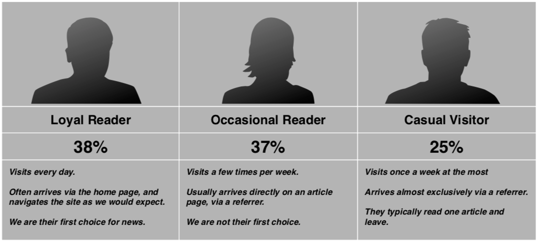
A deep dive into the web analytics data confirmed many of the observations made in the heuristic analysis. I found that loyalty was in decline, while occasional and casual visitors had become the majority.

Using Site Calalyst, I could see some clear patterns:

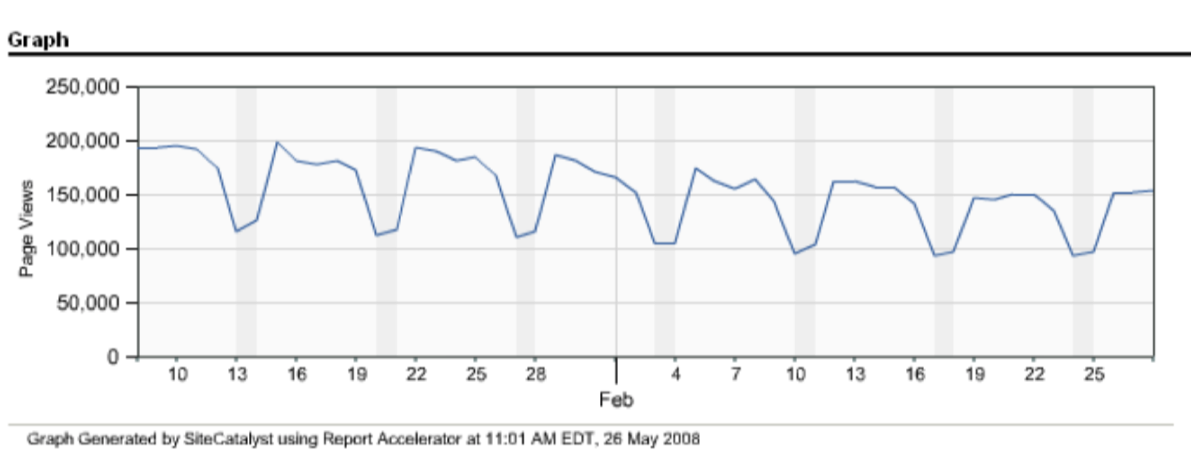
1 — Home page visits were declining year over year, and it was not a slow steady leak; it happened in waves that coincided with “force-feeding” campaigns, as this chart shows. Force-feeding was doing lasting damage.

2 — Most visitors came directly to an article page from Google News, but more than 40% read only one article then exited. The article page was the new home page, but it was doing a poor job of engaging readers.

3 — Heatmaps showed what users were clicking on and what they weren’t. As expected, graphics were ignored, while text links to relevant content were always engaging.

This was a good start: with this data I could make a case that we were leaving a lot of growth on the table. Furthermore, I could show that some business practices were actually driving loyal readers away. However, senior management felt stuck between a rock and a hard place; there was a persistent belief that “user-centred” meant no advertising, and everything is free. As I was once asked,

“David, if we give users everything they want, won’t we go out of business?”

I needed hard evidence that user-centred design could solve real business problems.

Experiment and Measure

As UX Director, I had the scope to make small experiments on our websites, and measure the effect — sort of a homemade A:B test. This was a very powerful tool, which allowed me to form hypotheses using heuristics and web analytics, then create experiments, and observe the difference in user behaviour.

Here’s one example. (I have many.)

Finding an Alternative to Force-Feeding

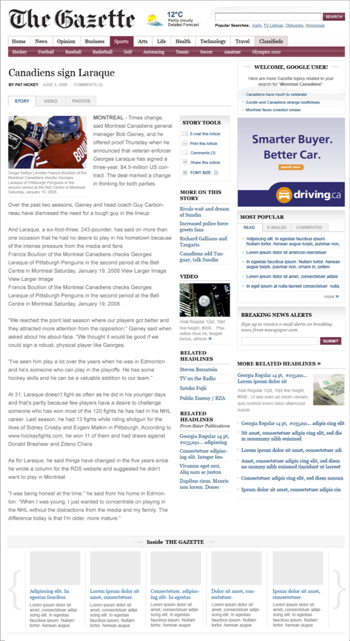
The solution to the force-feeding problem seemed outlandish at the time, but it's common practice now. Hint: it has to do with the links at the bottom of this article mock-up.

Usability expert Jared Spool once wrote about an e-commerce idea he called the “seducible moment”. It works like this: normally, users are task-driven, and when they are on a mission, you had best stay out of the way. In the case of a news site, users want the news. If you try to push them toward the travel section instead, they will ignore you. Push too hard and you’ll annoy them.

BUT, give them what they want, without hassles, and they’re quite the opposite of annoyed. They’re satisfied, and their confidence in your product is higher. This is the seducible moment, and it’s just about the only time you can suggest a travel article to a news reader without bugging them.

There was just one problem: this seducible moment happened when the user was finished reading the news. Logically, the answer was to put the travel link at the bottom of a news article. This solution was too counterintuitive; how could I recommend such a thing?

So, we tested it, head to head against the old approach. It wasn’t even close. The seducible moment beat force-feeding by a 3 to 1 margin.

Proposing a User-Centred Approach

By conducting  experiments like the one above, we gathered powerful evidence in favour of a user-centred redesign. Our maxim would be “know your audience,” which meant, consult with actual users in every phase of the project.

1 — In the planning phase, ask, never assume, what is working and not working for users.

2 — Validate design ideas as early as possible, by testing static mock-ups with users.

3 — As confidence grows in the general design direction, build and test light-weight prototypes, to validate ideas that require some interactivity.

4 — Before launching, allow users to preview the beta. Give them time to get used to the new site, and make an effort to address issues they raise.

A change in culture

Our goal was to drive organic growth through loyalty and positive word-of-mouth. It would take more than a sound UX process; we needed to get the entire company on board for a culture change.

In the past, business needs took priority over readers’ wants, needs, and expectations. My UX strategy document was nothing less than a manifesto to change this orientation 180 degrees:

“We will achieve our business objectives by putting users first ... When corporate culture is in conflict with the users’ goals, the culture must change.”

This was a big ask, but the company was ripe for change. I should also say that I had some great allies who used their influence and talent to help align stakeholders behind this new philosophy.

It took a lot of work to get to the starting line. While designing and building the news network was by no means the “easy part” of the project, the real win was the consensus to adopt a user-centred culture, which was an important new direction for the company.

When we relaunched the network six months later, traffic quickly grew 50% year over year. What's more, advertising revenue went up 75%, because we were targetting high-value content more efficiently.