HOOPP Website Redesign
HOOPP is the Healthcare Of Ontario Pension Plan. I worked with HOOPP and their marketing agency in 2011 on the redesign of their website. Specifically, I worked on all aspects of the UX strategy, from persona development to user-tested wireframes, and oversaw the execution and delivery of the front end.
Here's a quick run through of the whole process.
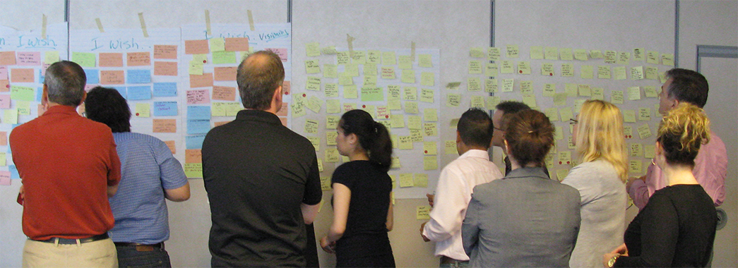
Tapping into Internal Experts
In a one day workshop we quickly gathered and prioritized input from internal experts who had daily interaction with website users.
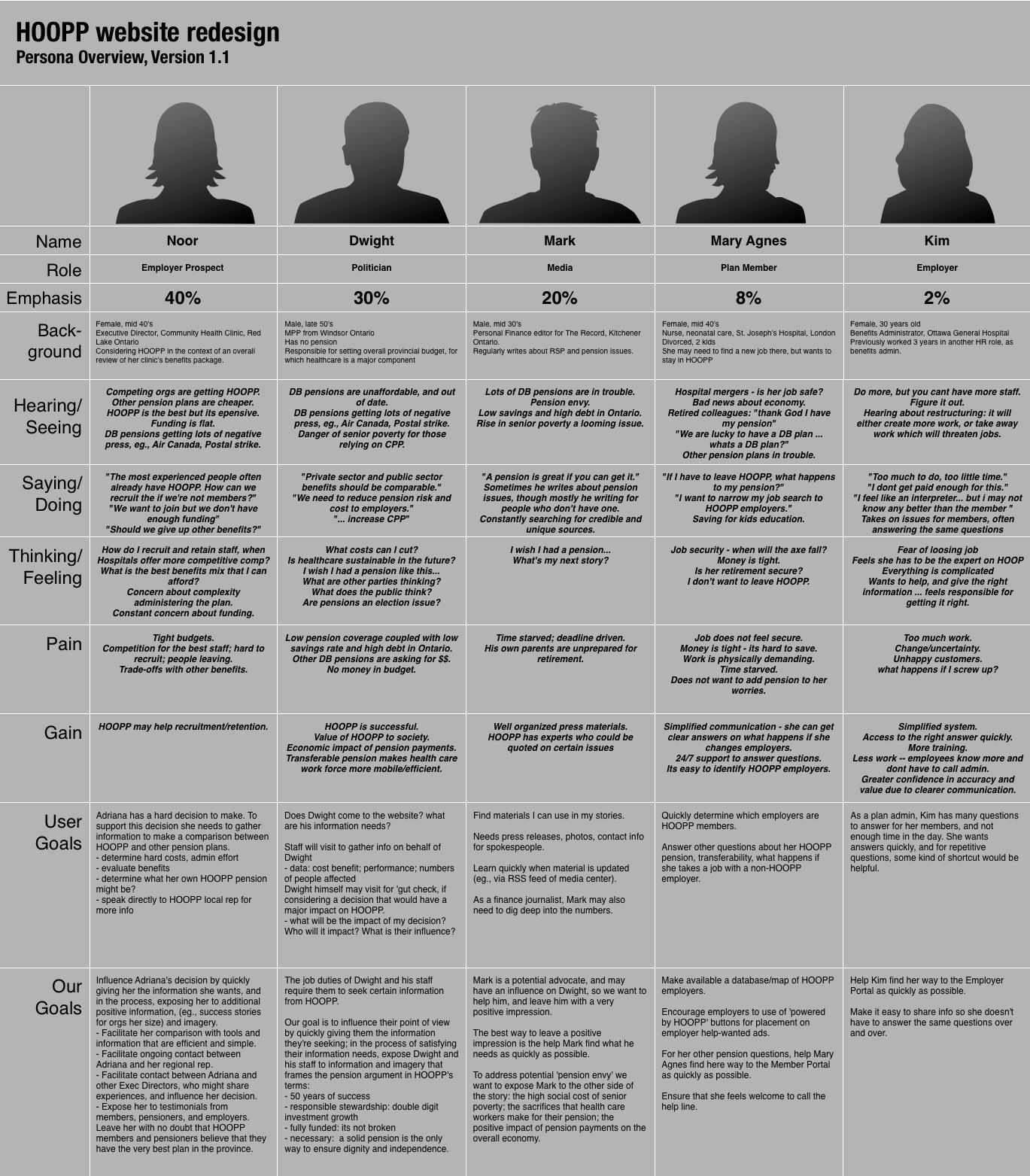
Personas
From the information gathered, I summarized all of our personas in this single-page chart.
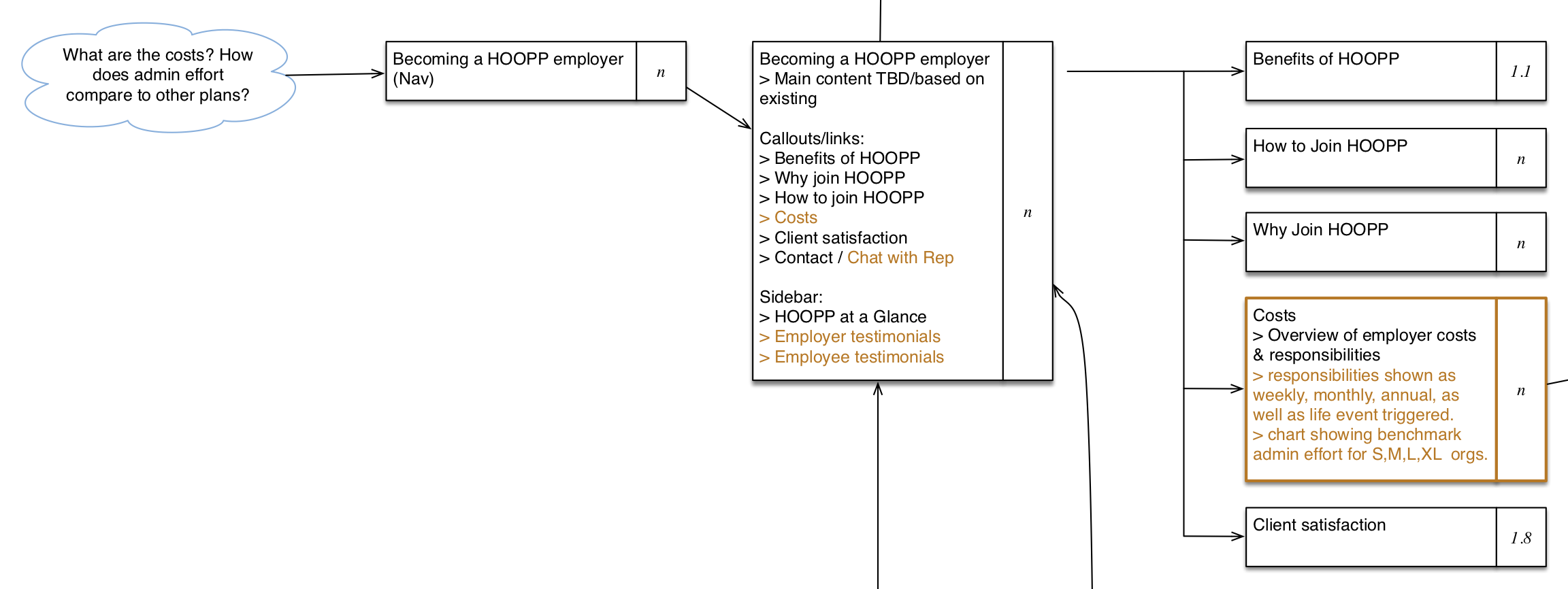
User Flow Diagrams
Working towards an information architecture, I made flow diagrams showing how each persona would persue the information they needed from the HOOPP website. The example below is a detail from the “employer prospect” diagram, which shows this persona researching her decision whether to join HOOPP.
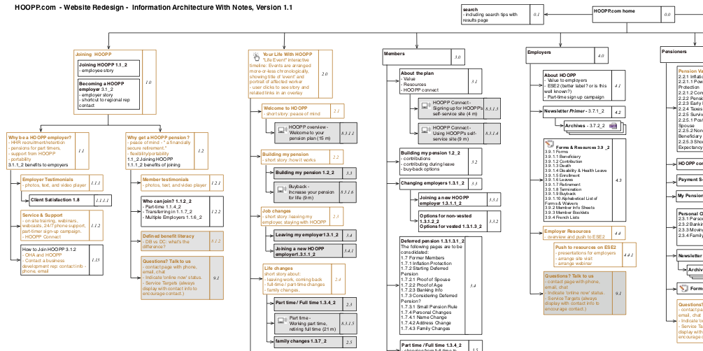
Content Analyisis and Detailed Site Map
I developed multiple scenarios for every persona, and consolidated these into a site map that would fulfill these scenarios.
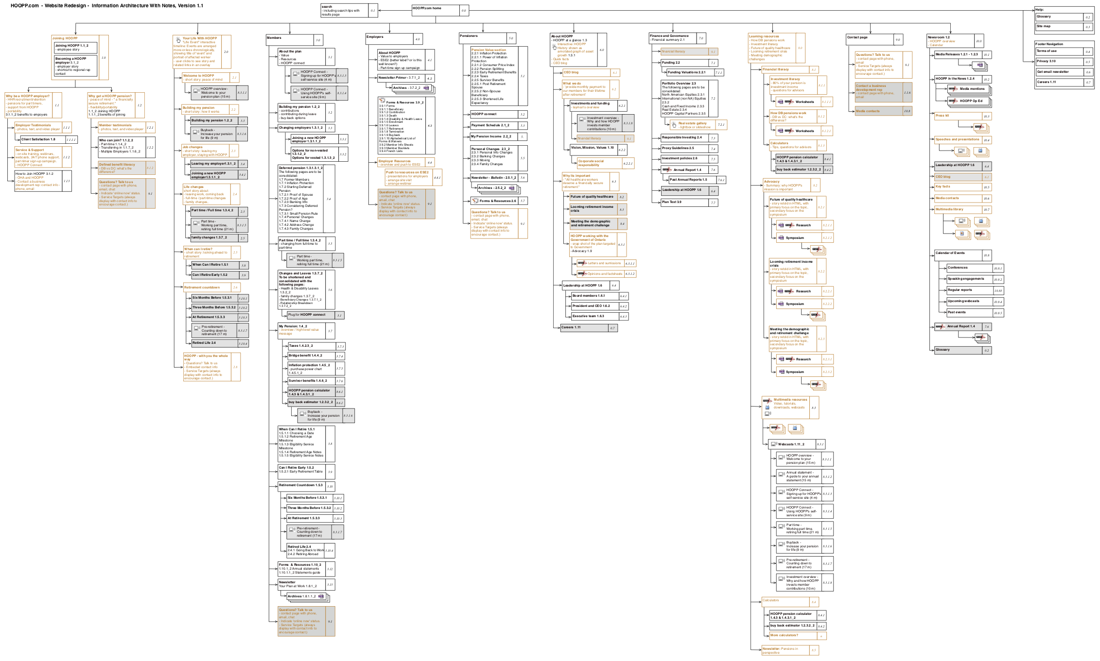 A detail from the site map.
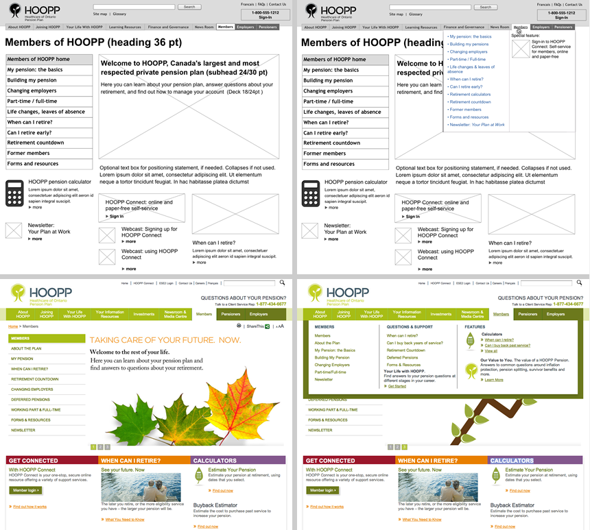
Wireframes and Usability Testing
From the site map I could extrapolate primary and secondary navigation, as well as the rough content requirements for each screen. I made wireframe mocks of key screens (usually the screens near the top of the hierarchy). These wireframes went through several rounds of client review, followed by usability testing.
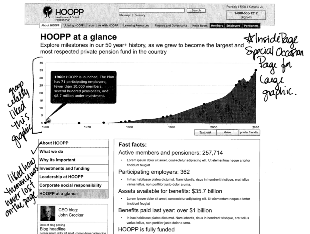 The final wireframes were then skinned by a graphic designer, and built by a front end developer.
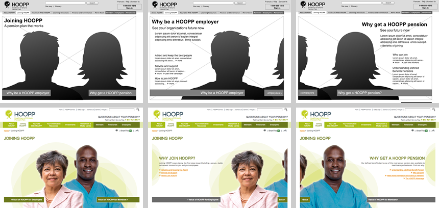 Another look at wireframes versus final designs.