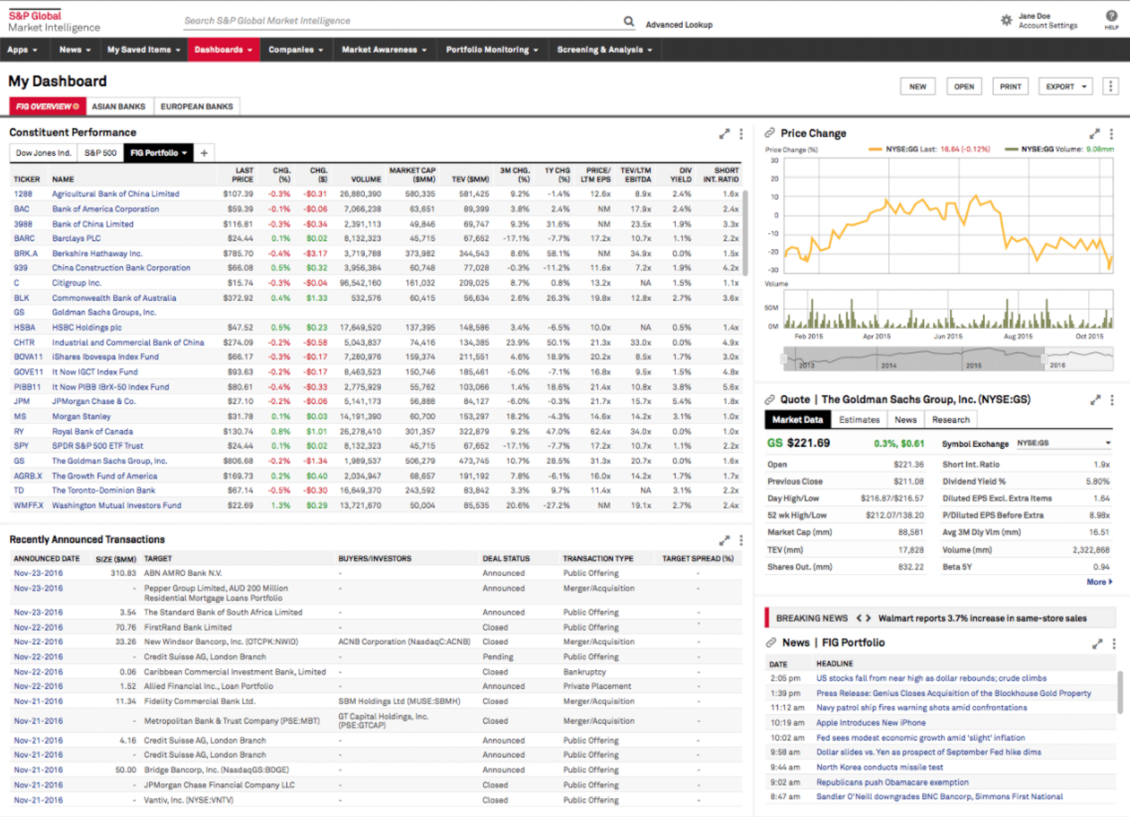
S&P Global Market Intelligence
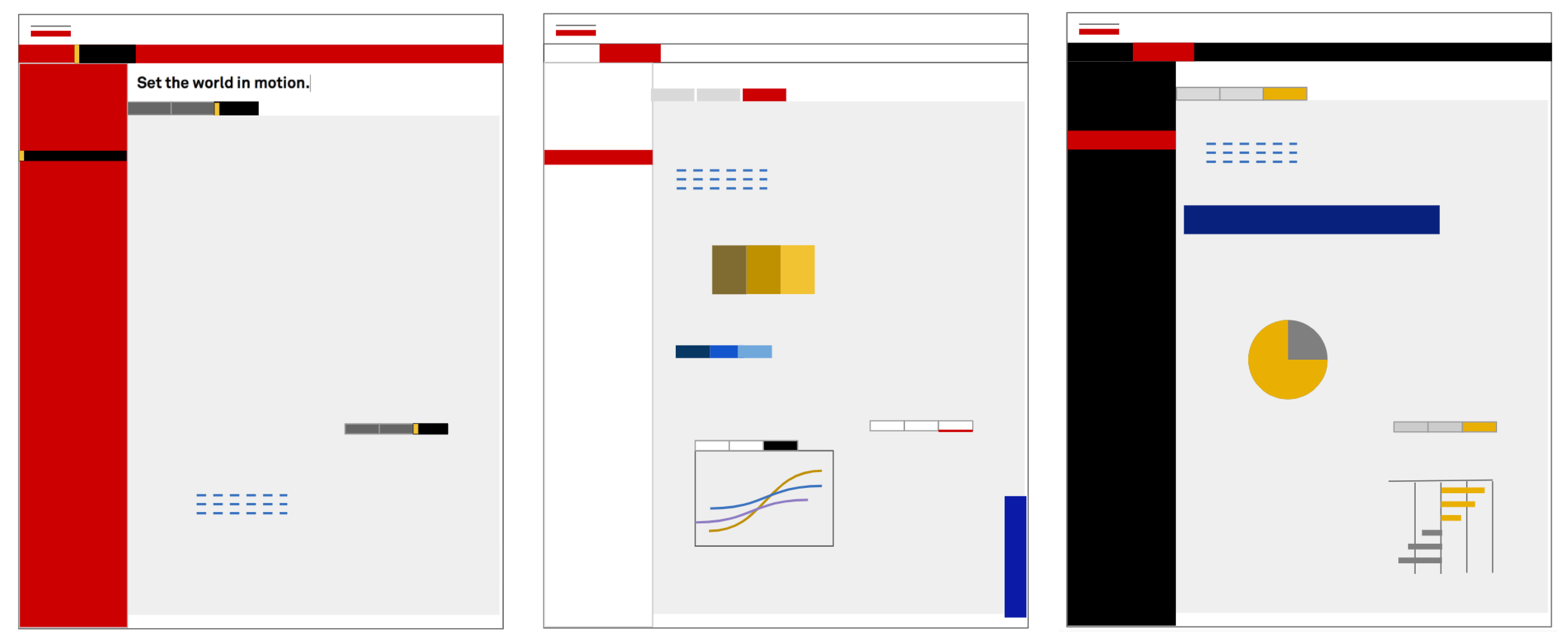
Product Redesign

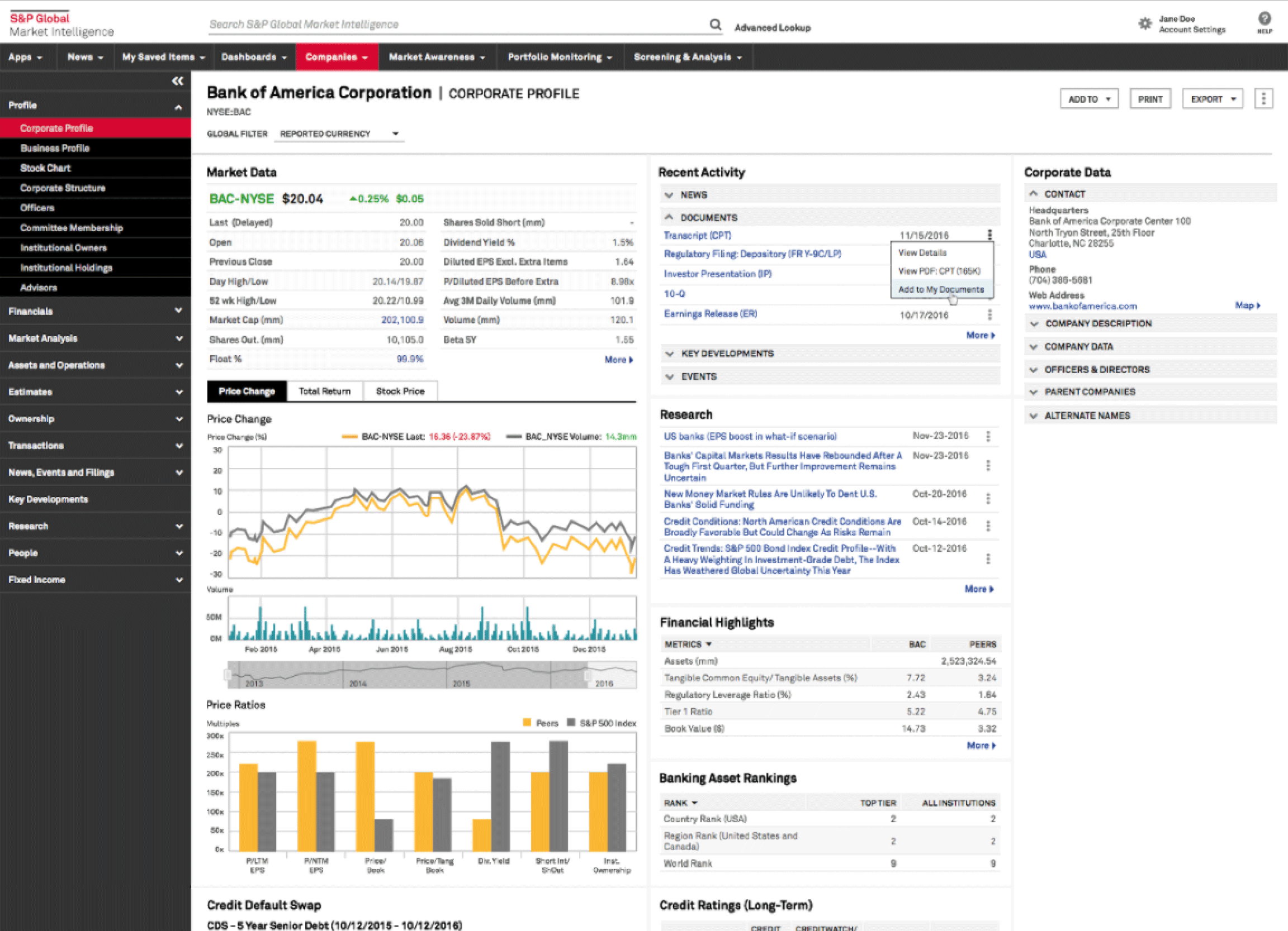
After a merger of companies and products, many teams were brought together to create the new, consolidated Market Intelligence platform.

UX Research

The first step in a large design project is always to gain an understanding of your customers — their context, their relationship with your product, and what they think and feel when they use it.

There's really no better way to learn these things than to meet your customers, and talk to them. Our customers were investment bankers, and for this project I personally interviewed about 20 IB's, while also coaching other team members on the interview process.

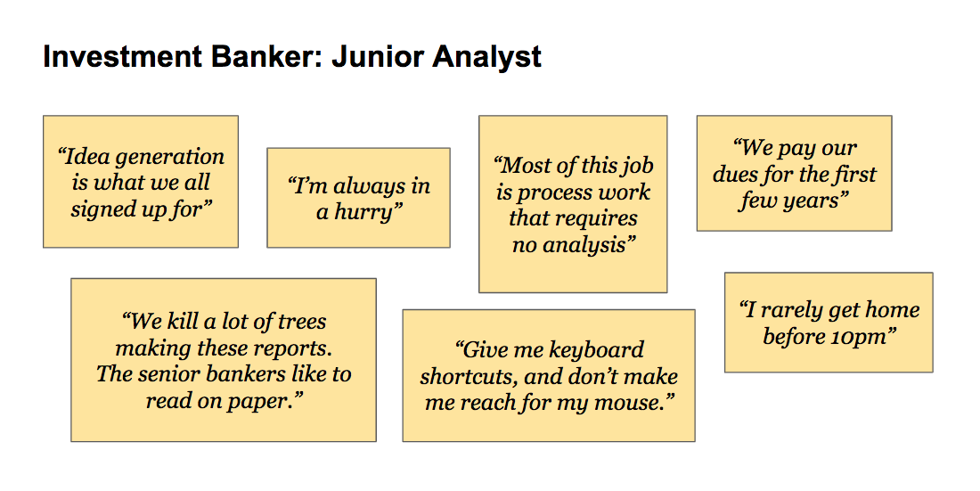
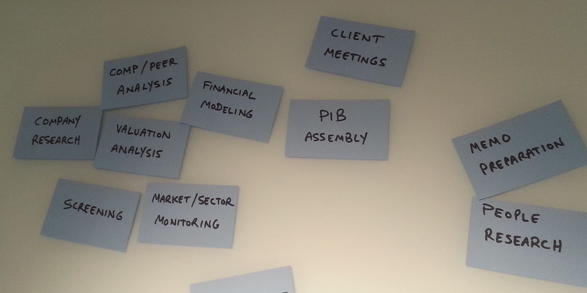
We quickly realized that the junior analysts were the ones spending all day working with the product. They work hard and are always in a hurry. The told us that they often have to use several different products to do their research. They hate this because switching breaks their flow; a different product means a different interface, which means too much thinking about stuff that's not banking!

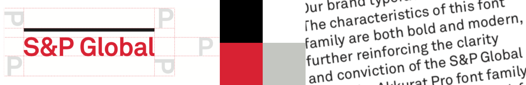
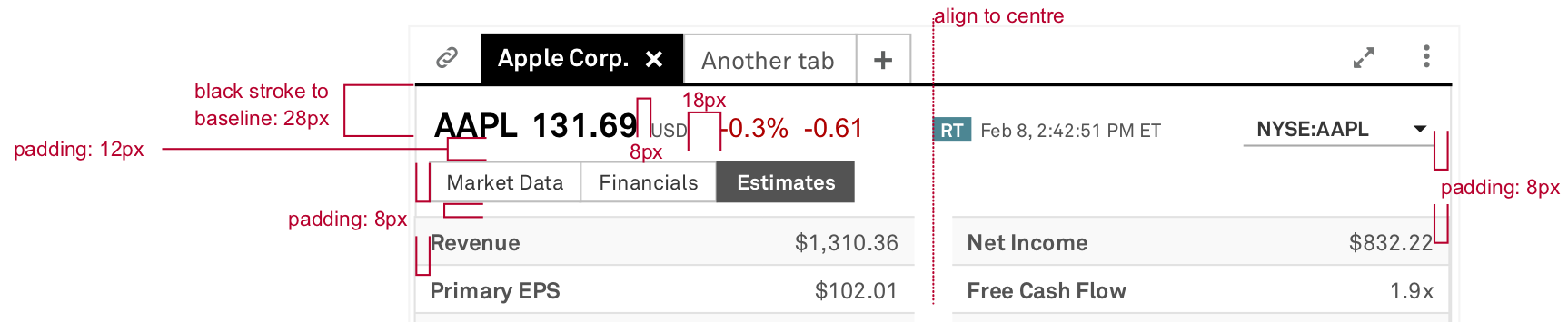
We understood that, in bringing multiple products together, we needed to ensure that they not only looked the same, but behaved the same. That is, they needed unified UX standards.

The Brand DNA

A brand is much more than the Creative Direction, and certainly more than the logo, colour palette, and font. A brand is the sum of the all experiences your customers have with your products. And the brand DNA is the unifying philosophy underlying the design of those experiences.

One word stood out in summing up S&P Global’s DNA: ESSENTIAL

What is essential? There are two ways to look at it:

1. 2.
Necessary, crucial The essence, clarified
Comprehensive The fundamental elements
Can’t do without it Absence of superfluity
Delivered by data and technology Delivered by UX

The UX team would own the second column: focus on the essential and remove non-essentials. Here was a brand principle that could inform our design decisions.

Inspiration

The new brand guidelines, as received, were very bold. Clearly the company was serious about taking a new direction.

I took this as a jumping off point when looking for inspiration. The modern, Gothic typeface, and aggressive red, black and white palette were evocative of some of the strongest graphic design in history.

But perhaps a bit too radical for financial services?

We needed to dial back the aggressiveness of the palette without watering down the strong, confident intent. Saturated yellow and blue could balance the red, and provide harmony. Mondrian provided inspiration.

With this extended palette, the team created dozens of colour thumbnails (below.) Of course these are very sketchy and spontaneous, but from this exploration came a clear Creative Direction: control with and edge.

The Mocks

Through this process of research, problem definition, and ideation, we explored the philosophy underlying our Brand DNA — the essential, clarified; and defined a Creative Direction — control with an edge.

Our next objective was to mock up key pages and apply these ideas to actual content. Below are two of the actual mocks created and approved at this stage.

The UX Style Guide

Ok, style guides are not glamorous. But with over 30 product teams, and hundreds of developers, many of whom were working together for the first time, we needed a style guide to provide order, and act as a single source of truth.

At first, the style guide was simply a web-based catalogue of UI elements. Over time, as UI elements were created by developers, we added these live samples to the catalogue, which improved consistency across the product while saving developer effort.

As the company worked to launch a beta product on a very aggressive schedule, the style guide was crucial in keeping the UX build on track. The success of the style guide laid the groundwork for a design system, which followed.