Rosetta Stone

Rosetta Stone’s mission is to deliver an immersive language learning experience. Immersion is their pedagogical approach, but it also informs UI design. If the user is aware of the interface, it breaks their flow.

Micro-interactions

As designers, we were challenged to strip away all potential distractions, including labels and instructions. We couldn’t say “speak now.” It simply had to be obvious.

We created many animated mocks, to work out key transitions and prompts.

Above is a short video that explores using colour and sound to cue the user to speak, and to assess their performance.

The video to the right is an animation we made to explore navigating to a card, and presenting the cue to speak.

In the last video, you can see how all of these micro-interactions came together in the final product.

There's a lot of UI on this small screen, but it's practically invisible, because it requires no attenion. When the UI merges with the content, the user is free to focus on learning.

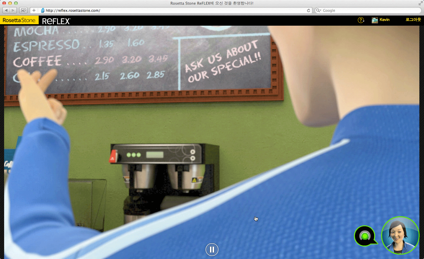
Iterating Towards Minimalism

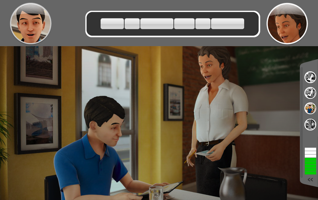
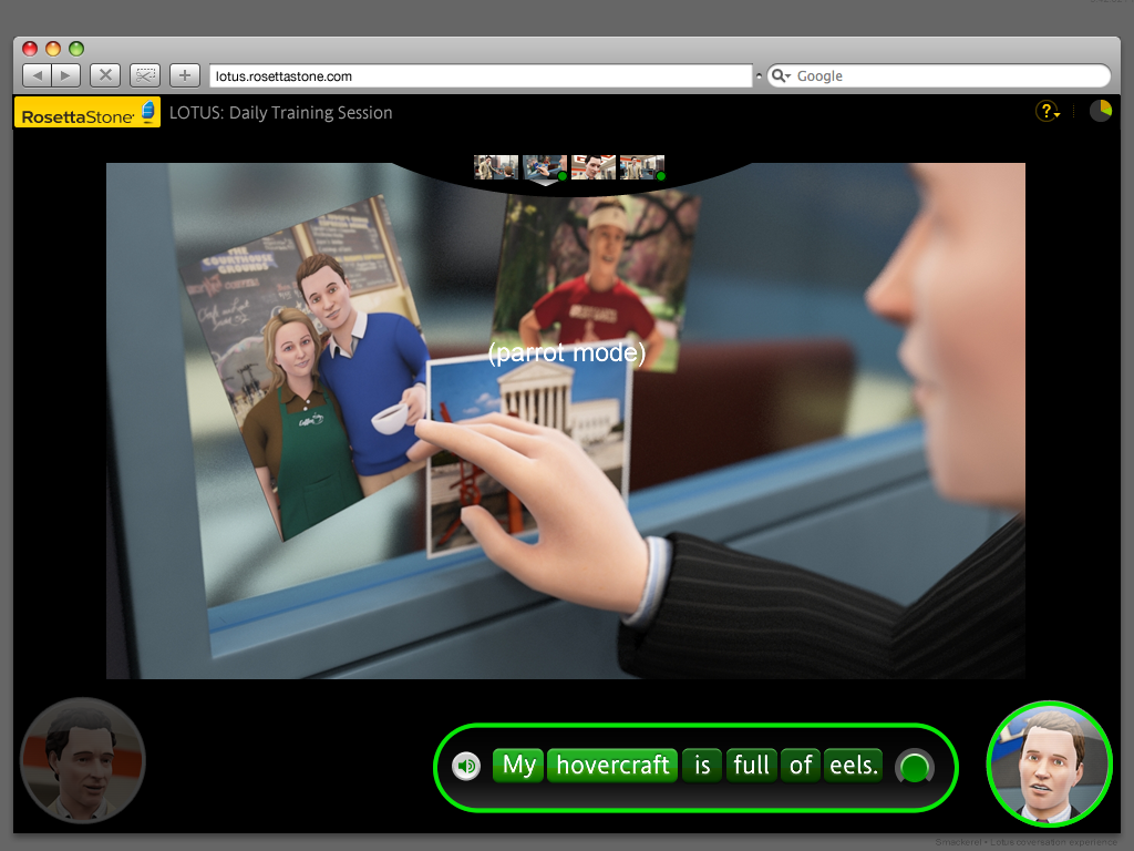
This minimalist approach — patiently stripping away distractions — applied to screen design no less than micro-interactions. In the three screens here, a conversation unit was designed and redesigned, reducing the UI with each iteration.

By the final version, below, most of the graphical UI was removed or merged with the content, and the unit was largely voice driven.